控件
通用属性
各控件包含以下通用属性:
width
控件宽度,计算规则参见 布局
height
空间高度,计算规则参见 布局
- 为最外围行属性时,表示该行的最大高度
- 为子元素属性时,表示该子元素高度,但不会超过所在行的高度
value
控件值,比如文本框内容等
- 可选属性
- 可以为
list控件设置字符串数组值
textColor
控件文字颜色
- 可选属性
- 设置文本颜色,字符串,比如 #ff0000 表示红色
fontSize
控件文字大小
- 可选属性
- 设置文本字体大小,单位为像素,整数值
下面分别介绍各种控件。
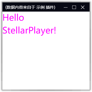
文本框 - label
显示一行或多行文字,可通过 \n 换行 如果指定了 value 属性,则文本内容为 value 属性, 否则文本内容为 name 属性
{
    'type':'label',
    'name':'Hello\nStellarPlayer!',
    'height': 60,
    'textColor': '#ff00ff',
    'fontSize': 30
}
2
3
4
5
6
7
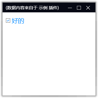
复选框 - check
显示一个复选框供用户交互, name 属性为其文本,value 属性为其勾选状态 要动态获取它的勾选状态,请参考 API 或者 数据绑定
{
    'type':'check',
    'name':'好的',
    'height': 60,
    'textColor': '#0088ff',
    'fontSize': 20,
    'value': 1
}
2
3
4
5
6
7
8
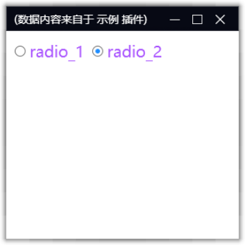
单选框 - radio
显示一组单选框供用户交互。 一组 radio 必须放到同个 group 下. 要动态获取它的勾选状态,请参考 API 或者 数据绑定
controls = {
    'group' : [
        {
            'type':'radio',
            'name':'radio_1',
            'height': 60,
            'textColor': '#aa55ff',
            'fontSize': 20,
            'value': 1
        },
        {
            'type':'radio',
            'name':'radio_2',
            'height': 60,
            'textColor': '#aa55ff',
            'fontSize': 20,
            'value': 1
        },
        {'type':'space'}
    ]
}
2
3
4
5
6
7
8
9
10
11
12
13
14
15
16
17
18
19
20
21
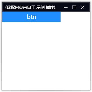
按钮 - button
显示一个按钮供用户交互,要响应按钮点击事件,请参考 事件
name 属性为按钮显示的文字,注意按钮默认会自适应其文字大小,如果要指定按钮大小,需要将 matchParent 属性设置为 True
controls = [
    {
        'type':'button',
        'name':'btn',
        'height': 40,
        'width': 200,
        'textColor': '#ffffff',
        'fontSize': 20,
        'value': 1,
        'matchParent': True
    },
    {'type':'space'}
]
2
3
4
5
6
7
8
9
10
11
12
13
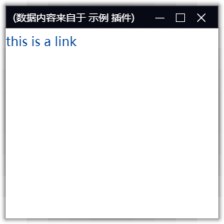
超级链接 - link
显示一个超级链接。 用户可以点击该链接打开浏览器转到相应页面 其中 name 属性为超级链接的文字,value 属性为需要跳转的链接地址
controls = [
    {
        'type':'link',
        'name':'this is a link',
        'height': 40,
        'textColor': '#004499',
        'fontSize': 18,
        'value': 'http://bing.com'
    },
    {'type':'space'}
]
2
3
4
5
6
7
8
9
10
11
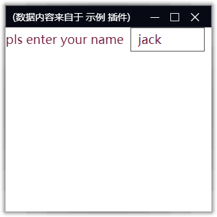
文本输入框 - edit
显示一个文本输入框,用于接收用户输入。 要获取用户输入的内容,请参考 事件 和 数据绑定
controls = [
    {
        'type':'edit',
        'name':'pls enter your name',
        'height': 40,
        'textColor': '#772244',
        'fontSize': 18,
        'value': 'jack'
    },
    {'type':'space'}
]
2
3
4
5
6
7
8
9
10
11
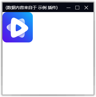
图片 - image
显示一个图片,支持网络图片或者本地图片。
controls = [
    {
        'type':'image',
        'name':'img',
        'height': 200,
        'width': 200,
        'value': 'https://static.coldlake1.com/staticsource/website-master/assets/app-logo.5379c2ba.png'
    },
    {'type':'space'}
]
2
3
4
5
6
7
8
9
10
图片也支持 base64 png 格式的 data Url
controls = [
    {
        'type':'image',
        'name':'img',
        'height': 200,
        'width': 200,
        'value': 'data:image/png;base64,iVBORw0KGgoAAAANSUhEUgAAACgAAAAhBAMAAABZ3/SWAAAAMFBMVEUDAwOUlJTf3989PT23t7dtbW309PQXFxfHx8dTU1OoqKiBgYH8/Pzr6+vU1NMpKSndUWp9AAAACXBIWXMAAA7EAAAOxAGVKw4bAAAB8klEQVQoz22SQUgUYRTH/yCyiIdllaJWC5xiGGEVcRHyUihLybKEUh5qK2ixYY1PWCHprEyybLnNElTQSRAKy0PQwUMXBxnCnh0SBtEpMAqq3bp56uJ7X6166Dt883+/+d6bN//3gf6zQHR6wRRl22of+rd78Cf0rflYbGGG8YQiBfs5gMux1xe7PloDx1T1UcVU8HoYTs3oVP9nnKMzhDVmuF6v9o2DphAr/Gio1eH6MIcZvIckSKx8rnGKw7cCI6+k3kBt7GRAawXgGlYLaOQT9vQzs3TkBvmuQN57ifLpl9ncYjFmEnfYDnqIdqKtK8lKLh13lmgD0Rpo7Bx/u7M/OWLuHO+bpRVMKpDqCImsUjwddKfmH5DXd14M+ao7zA3ZwedAkd8iLsnOKz9I2ix6IdA7qn/bMehTKKokcDUj0rKyxbnfonYE3kzIwSH7XrYlL7JDMayKa+spo8tQ3izL7ZDg9UuOd3+0kipbcyxvZQg/mrVF28tO0XnzhbPGewnDjbqRd6Mj8fSyIbBZwW1I6JZak8ld02A1HsnA1W5yT8Hmkiftb+AxXJzVcLP8PSHW0wXcYdik83PFX/qlx4Ahnh6+Mp08HoHREwfsg/sPYmp/xPlW1CF2B/9OffoJDiCiV8vOYtulAg5D4G4B9RXZAwWBUakn6fPhAAAAAElFTkSuQmCC'
    },
    {'type':'space'}
]
2
3
4
5
6
7
8
9
10
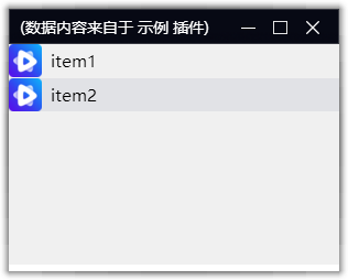
列表 - list
显示一个列表控件,用于展示多条数据。 定义一个列表,需要提供列表字段和数据:
- itemlayout:列表中各项的布局(列),可以是嵌套的复杂布局
- value:列表中所有记录的 list,list 中每一项表示列表中的一条记录, 每条记录根据 itemlayout 中的定义进行显示,记录的属性值与 itemlayout 中各个控件的 name 一一对应。
- itemheight:列表中每个元素的高度,默认 30
- marginSize: 列表中各个元素间距
- separator:列表各个元素间是否显示分隔线
itemlayout = [
    [
        {
            'type':'image',
            'name':'image',
            'height': 30,
            'width': 30
        },
        {
            'type': 'space',
            'width': 8
        },
        {
            'type':'label',
            'name':'desp',
            'textColor': '#000000',
            'fontSize': 15,
            'width': 100
        }
    ]
]
value = [
    {
        'image': 'https://static.coldlake1.com/staticsource/website-master/assets/app-logo.5379c2ba.png',
        'desp': 'item1'
    },
    {
        'image': 'https://static.coldlake1.com/staticsource/website-master/assets/app-logo.5379c2ba.png',
        'desp': 'item2'
    }
]
controls = [
    {
        'type':'list',
        'name':'list',
        'itemheight': 30,
        'itemlayout': itemlayout,
        'height': 200,
        'value': value,
    },
    {'type':'space'}
]
2
3
4
5
6
7
8
9
10
11
12
13
14
15
16
17
18
19
20
21
22
23
24
25
26
27
28
29
30
31
32
33
34
35
36
37
38
39
40
41
42
上面代码定义了一个列表,列表有两列,由 itemlayout 定义,包含 image 和 desp,两列间有留白 space 列表有两个元素,由 value 定义,每个元素定义了各自的 image 和 desp
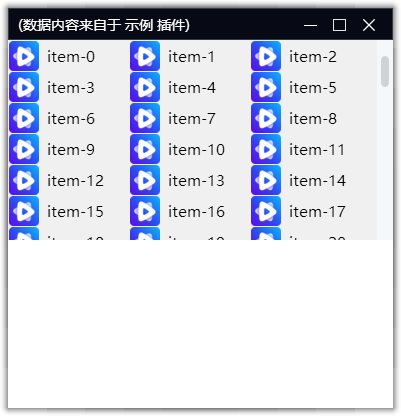
网格 - grid
网格与 list 类似,用于展示多条数据。 区别是网格会横向布局,自动换行。
- itemlayout:网格中各项的布局(列),可以是嵌套的复杂布局
- value:网格中所有记录的 list,list 中每一项表示网格中的一条记录, 每条记录根据 itemlayout 中的定义进行显示,记录的属性值与 itemlayout 中各个控件的 name 一一对应。
- itemheight:网格中每个元素的高度,默认 30
- itemwidth :网格中每个元素的宽度,默认 30
- marginSize: 列表中各个元素间距
- separator:列表各个元素间是否显示分隔线
itemlayout = [
    [
        {
            'type':'image',
            'name':'image',
            'height': 30,
            'width': 30
        },
        {
            'type': 'space',
            'width': 8
        },
        {
            'type':'label',
            'name':'desp',
            'textColor': '#000000',
            'fontSize': 15,
            'width': 100
        }
    ]
]
value = [
    {
        'image': 'https://static.coldlake1.com/staticsource/website-master/assets/app-logo.5379c2ba.png',
        'desp': f'item-{i}'
    } for i in range(100)
]
controls = [
    {
        'type':'grid',
        'name':'grid',
        'itemheight': 30,
        'itemwidth': 300,
        'itemlayout': itemlayout,
        'height': 80,
        'value': value,
    },
    {'type':'space'}
]
2
3
4
5
6
7
8
9
10
11
12
13
14
15
16
17
18
19
20
21
22
23
24
25
26
27
28
29
30
31
32
33
34
35
36
37
38
39
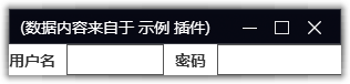
空格 - space
用于留白,只影响后面控件的位置,不会生成实际的控件
controls = [[
    {'type':'edit','name':'用户名', 'width': 0.5},
    {'type':'space'},
    {'type':'edit','name':'密码', 'width': 200}
]]
2
3
4
5
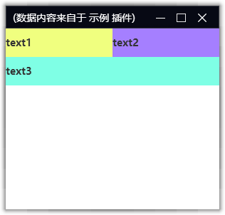
控件组 - group
描述控件集合,用于将一组控件作为一个整体进行布局。 其子元素的高宽基于 group 的高宽来计算。
- dir 排列方向:可选值为 horizontal(水平排列,默认值)、vertical(垂直排列)
controls = [
    {
        'group': [
            {'type':'label','name':'text1', 'width': 0.5},
            {'type':'space'},
            {'type':'label','name':'text2', 'width': 200}
        ],
        'height': 40
    },
    {'type':'label','name':'text3', 'height': 40},
    {'type':'space'},
]
2
3
4
5
6
7
8
9
10
11
12
group 组织了一行水平排列的控件组,然后再和其他控件垂直排列布局。
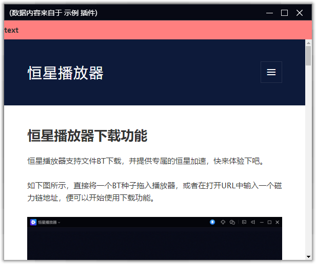
浏览器控件 - webview
- value :浏览器控件 默认打开的网页地址
controls = [
    {'type':'label','name':'text', 'height': 40},
    {'type':'webview','value':'https://www.stellarplayer.com/blog/'}
]
2
3
4